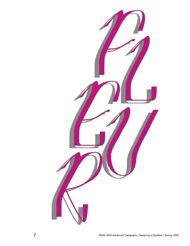
FLEUR
Type Design - Type Specimen Book
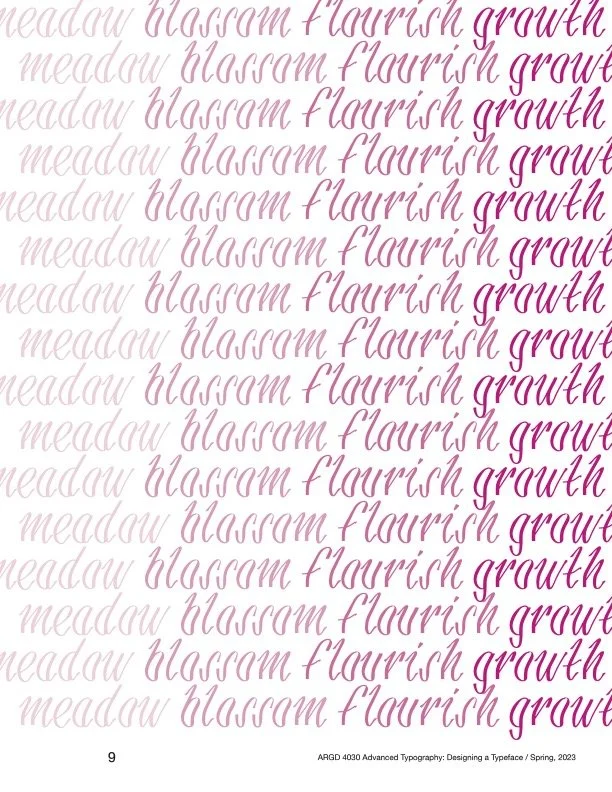
Drawing inspiration from nature, Fleur investigates the relationship between sunlight and flowers through type design.
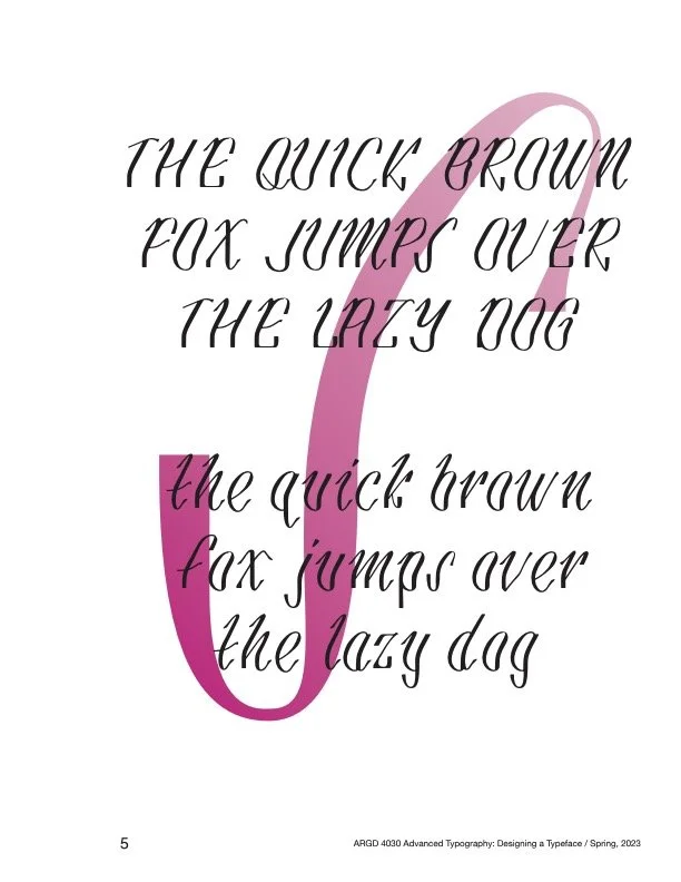
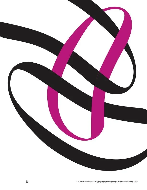
Fleur portrays shadows cast by sunlight against flower stems through a high contrast stroke. I developed each letterform and cut their vertical stems in half, leaving just the shadows. I also crafted my own version of italic text by mimicking the motion of flowers growing towards light. The letters start upright then are introduced to a vertical stress 2/5 of the way up the x-height, creating an organic movement that implies the alteration of a flower’s development in order to reach the sun. The flourishing serifs embody the sprouting of a flower bud, implying that the type is still growing, thus reinforcing the movement.


When my research began, I was drawn to delicate, high contrast typefaces that had italic versions. I wanted to create a fresh take on this kind of typeface by using an organic structure rather than a ridgid/architectural anatomy. Flower stems, and their relationship with their environment, became my visual inspiration and the foundation of my concept.